
branding: photography by angel
photography by angel
Angel Malone is a family friend of mine who does fantastic work in the Chicago area. Her brand, however, was in need of a facelift. Given creative license to run with a new idea of my own creation, I was eager (and excited) to get working!
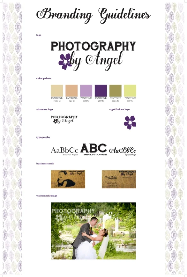
My inspiration for this refresh came from a conversation with Angel. I gave her a call to discuss the project, and I asked what she felt was her strong suit, or rather, why she believes customers seek out her services and often return for more photo shoots. Angel shared that she is often complimented on her ability to capture people being their true selves and that her subjects' personas really shine in her pictures. This tidbit sparked an idea in my head and served as the muse for my nature-inspired brand concept.

The original logo, on the left, lacked meaning. What does a shooting star and the fonts selected say about the company? The logo on the left, my updated version, speaks to Angel's business. The flower hints at the nature motif this rebrand is centered upon. The fonts show an elegance, yet handmade feel. This is reflective of the experience of shooting with Angel: customized to your personality and comfort levels, yet professional.

what i learned
Rebranding can be a lot of fun, but it's still a lot of work. In some ways, it can be more challenging because there is already a brand in place. In this case, Angel asked that changes in logo, for example, be kept subtle so that the transition wouldn't be as abrupt. Having any restrictions will in some way stifle creativity, but in this case, I found it fairly simple to give the old logo a newer, fresher feel. This was my first venture into experimenting with images and vectors together, which was exciting and at times challenging. Figuring out how to incorporate the two could be tricky, but trial and error seemed to be the best way to find the optimal solution.