Dreadful, Delightful, Déjà Vu
If there’s one thing I really dread, it’s déjà vu. The movie “Groundhog Day” is probably my worst nightmare. I need variety. I need excitement. I need to mix it up.
This is why I gravitate towards art. There is so much freedom in it. Look at the basic elements and you’ll understand: line, shape and form, color, value, texture, space, perspective. It’s amazingly inspiring to me to look at a piece and see all of these details mesh together to create something that expresses the artist’s views, emotions, and opinions. In fact, the same idea can be expressed over and over again, yet each piece can be different depending on the medium, the artist, the current feelings toward the subject, etc.
One of the things I’m being constantly reminded of is that your work is never done. As a company’s marketing expert, in-house designer, and promotional guru, I am experiencing this first hand. While it can get frustrating, annoying, and downright daunting sometimes, I’m thankful for the ability to do this.
One of my not-favorite parts of my job is the initial revisit to something that needs to be revised. My first thought is usually, “Ugh, do I HAVE to do this again?” When you work and tweak and edit and manipulate something repeatedly, the last thing you want to do is look at it for “freshening up” ever again.
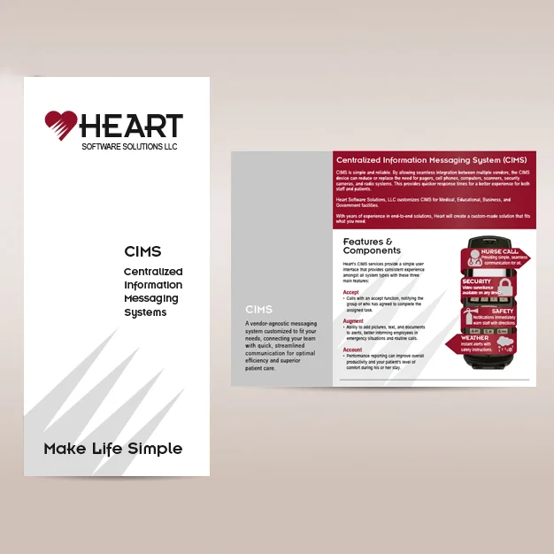
Once you get past the first look, though, you can see fault in your ways. I’ve been experiencing this over the last week. In fall of 2014, I created a brochure for my company’s unified communications systems specially designed for hospitals, senior living facilities, and schools. We were still in the process of figuring out what our brand would be, seeing as I was hired on in winter 2014 to assist in the design and rebranding of our company. The result was this:
Now, we were prepping for a senior living expo show, and we needed brochures for our unified communications systems. We pull out the brochure and let out a small shriek. This isn’t us. Not anymore. This definitely doesn’t accurately represent our company or our brand. Time for a refresh. Let the games begin.
Since coming on as marketing coordinator, I’ve been doing a lot of research, and I’ve created my first campaign: We take technology to Heart. I’ve found that our audience is connecting most with the personal, emotional approach. Since this is centered around the care of people–our family, our friends–I thought this was a great opportunity to put the campaign spin on this brochure.
I did this first by incorporating photographs into the brochure. When I began at Heart, there were definite hesitations towards using people in our imagery out of fear of looking to stock-photo-like. Since I use pictures so frequently now, though, I have found several different sites to find Creative Commons image, video, and audio files. I used my sources to find and edit images to put a human touch (literally) on this brochure. I condensed information and restructured the text to give a hierarchy. I incorporated more negative space, but in a way that doesn’t make the brochure look empty or too bare in certain spots.
This is now a piece I am proud to show and hand to interested business leaders and decision makers. This design better reflects the brand that Heart Technologies has created. It’s clean, it’s concise, it’s less aggressive yet doesn’t lack a personality. When you hold this brochure in your hand, you want to open it and learn more. The enticing nature of this design makes me proud of my work. Although I may not enjoy revisiting old projects, but I do love seeing an old piece gain a new life.


