#FreelanceFriday: Stocking Stuffers

Thank you Personal Creations for providing this image via Flickr.
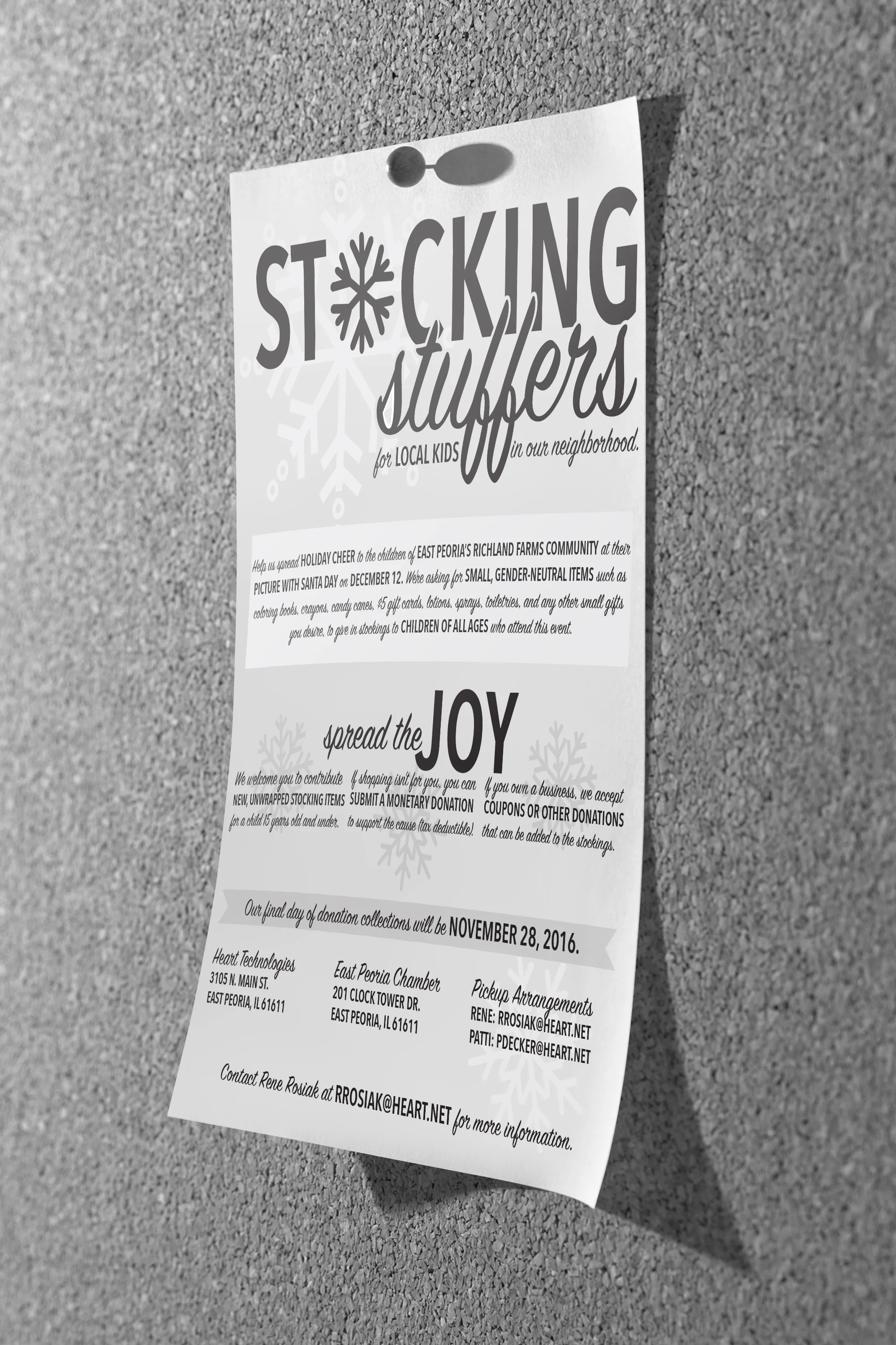
A coworker is wanting to do something really awesome for the kids of East Peoria, IL. As many communities do, there will be an opportunity for kids to visit Santa in December to ask him for the presents they hope will be waiting under the tree on Christmas morning. One neighborhood in particular, though, is home to many families who may not be able to give their children much of anything for the holidays.
We've all been there–hell, I'm there right now. Between switching jobs and moving, the money's going to be tight this holiday season. I can only imagine how difficult this would be with a child, whom I love and want to give many gifts to but can't financially do so. To help with this situation for these families in East Peoria, she is running a stocking stuffer drive. The goal is to collect small items–coloring books and crayons, $5 gift cards, and other little fun gift items–to stuff stockings with and give to each child when they visit Santa. All kids deserve to have something to unwrap during the holidays, after all.
Since this is a charitable cause, there is no funding for flyer design or production. She reached out to me and asked if I would be willing to donate my efforts to the cause. I'd be crazy not to. She provided me with a run-down of the event, and I had was given creative freedom to do what I wished.
Seeing that this was a charitable act, I knew the use of this flyer would be mass production. People will be printing them and handing them out, scanning them and sending it throughout their company, etc. For that reason, I chose a black and white layout. Black and white will always translate the same regardless of if its printed in color or Xeroxed in black and white. I also wanted to give myself a little challenge: Could I create a wintery atmosphere without the use of color?
To achieve this, I used a mix of scripted and sans serif fonts to achieve a personal, yet professional look. This also allowed for a fun, interesting way to highlight key information without the use of bolding. I then integrated snowflakes into letter design and the background to provide a winter-like feel to the design. I included additional elements, such as the ribbon line, to bring the concept back to Christmas and presents wrapped in bows.